

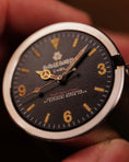


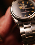


◇ About this peace
First STOCK peace with new logo. I could finish this as the peace worthy of new releasing the first new logo build.

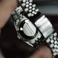
Looks nothing like my other aged peaces but there is. It's very neat but nice texture and reflections. Also reason why this looks neat is that I choose flat sapphire crystal. This has natural light aging so better to be more visible.

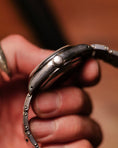
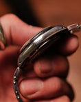
Aged like heavily worn and be loved for very long time. Surface became shiny and well-aged. Like tool as watch should be from first time.

This is The First STOCK with new logo. Don't miss this peace if you like it.
◇ About New Logo
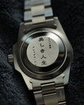
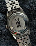
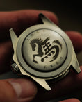
◆ New Logo, Inspired by Coming Home to Japan
After coming back to Japan few months ago, I started looking at my work differently.
Street signs, vintage shops, handwritten labels. Things I saw always before Amsterdam felt new again.
That’s when I decided to adopt “Hiragana” for new logo.
It didn’t feel like a design decision. It felt more like returning to something familiar.
◆ Less Noise, More Precision
I also began using a new printing technique from Japanese company.
This technique allows extremely fine text to be printed without losing detail.
Because of that, “Hand-Aged in Kyoto” at 6 o’clock is no longer needed to stand out. I could make it smaller, quieter. Almost like a hidden detail and just accent of red.
By reducing the noise, the whole dial started to right. This balance feels perfect now.
◆ “Hiragana” & “Katakana”
Hiragana and Katakana is Japanese alphabet and have exact same sounds. They even have same number of characters.
46 Hiragana.
46 Katakana.
Same pronunciation, same count. But very different histories.
Hiragana grew naturally from Kanji, used in personal writing and poetry.
Katakana was created more deliberately, for structure and clarity.
That difference still shows.
Katakana feels sharp and direct.
Hiragana feels round, fluid, and human.
They say the same thing, but they don’t feel the same.
◆ Why Hiragana Felt Right
For new logo, I wanted something softer. That doesn’t explain itself too loudly.
Hiragana reminds me of vintage & antiques. Things that weren’t designed to stand out, but to age beautifully.
This feeling fits perfectly with how I approach watchmaking.
English uses 26 letters.
Japanese uses Hiragana, Katakana,
and then… thousands of Kanji.
When I was a kid, learning all of that at school felt overwhelming. Honestly, I hated it so much.
But looking back now, sometimes wonder if that complexity is part of what shaped Japanese values and virtues.
The patience.
The attention to detail.
The respect for time and repetition.
Maybe that’s where Japanese craftsmanship really comes from.
【 DETAILS 】
【 DETAILS 】
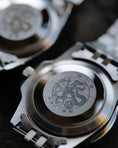
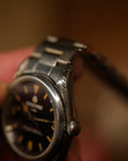
Material : 316L Stainless steel
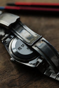
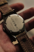
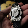
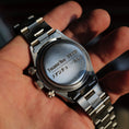
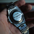
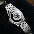
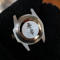
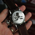
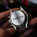
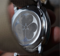
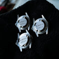
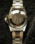
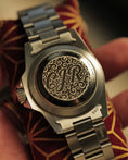
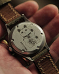
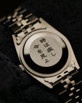
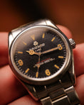
Dial : Vintage aging effects one by one by hand / "カタバミ時計ジャパン" is "Katabami Watch Japan" in Japanese. With "Katabami" my Japanese family crest
Glass : Domed acrylic crystal glass
Hands : Vintage aging effects one by one by hand / Silver OR Gold
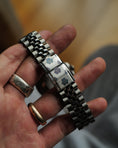
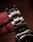
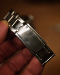
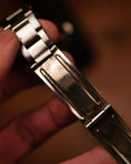
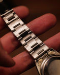
Strap : 316L Stainless steel Oyster, Rivet, Jubilee
【 SIZES 】
【 SIZES 】
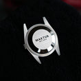
Case Diameter : 36 mm
Case Thickness : 13 mm with domed glass ( 11mm from top of bezel to back lid )
Lug Width : 20 mm
Lugs to Lugs : 44 mm
Buckle Width : 17 mm
【 MOVEMENT 】
【 MOVEMENT 】
SEIKO Group SII NH35A(Automatic)
Power Reserve : 40 Hours
Frequency : 21,600 vibrations per hour
Functions : Hack Function
As an art
Japanese craftsmanship & European artistic taste. Hope you can enjoy and appreciate handmade & imperfections.
Not just watch
This is more than a watch, piece of art, each one a unique creation. Craftsmanship meets creativity.
Art takes time
Each piece is handmade to Vintage Aging by my hand. Not printed, Not mass-produced like other watches. So please understand that it takes time.